

Colour is an important factor to consider when designing the interior of our homes, but most of us don’t actually realise how impactful colour can be on our emotions and well-being.
Colour psychology, the relationship between our emotions and colour, has been around for centuries dating back to ancient Egypt and Greece. More recently, chromotherapy has provided us with a deeper understanding of colours. The power of colours is still being studied however, experts have confirmed that the colours we surround ourselves with influence how we feel and act.
As a result, colours have the potential to significantly impact interior design and allow us to achieve a specific mood in our homes. Read on to find out how you can use colour psychology in your home design.
White
White is the colour of reflection and reflects more daylight than other colours. It can signify purity and innocence and relates to a clean and minimal layout. Using white in interior design makes the space appear bigger and allows more ‘room to breathe’. This feeling of spaciousness ultimately makes us feel more relaxed and comfortable.
White is a great base to layer with different colours and textures. However, be careful to not use too much white as this can create a clinical atmosphere with no character.
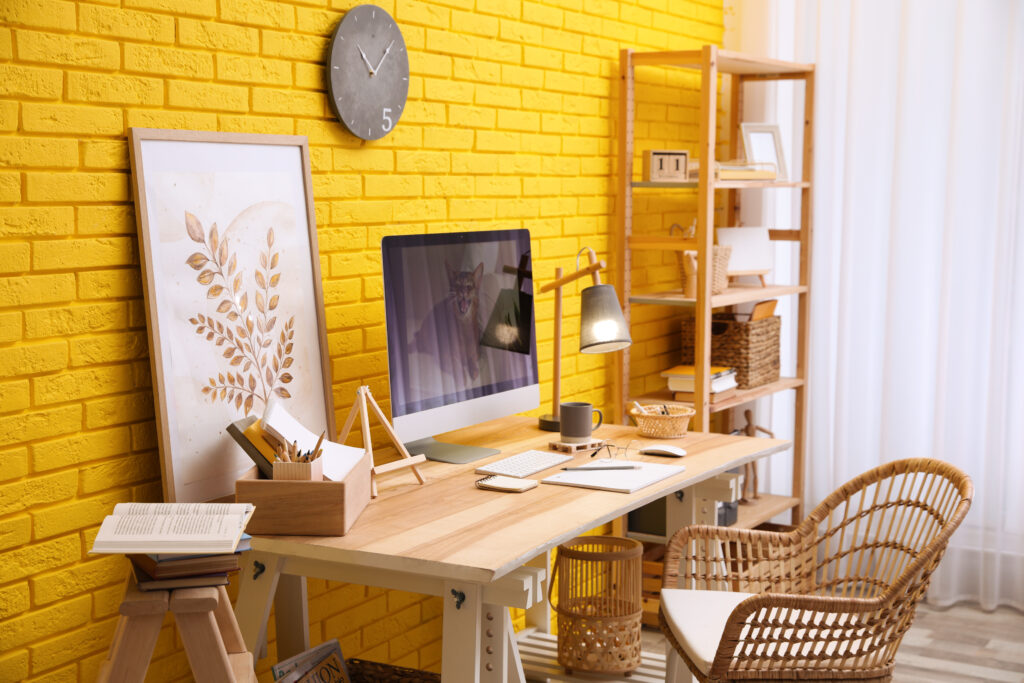
Yellow
Yellow is often considered a happy colour, relating to the warmth and brightness of the sun. It can create a cheerful and energetic atmosphere that helps you to concentrate and feel motivated. It has been shown to have the most impact in environments that require reflection and decision-making, such as an office space.
Yellow is best used in interior design as an accent colour as too much bright yellow can feel overpowering. However, pastel yellow can be more widely used due to its muted tone and can create a peaceful and joyful atmosphere.
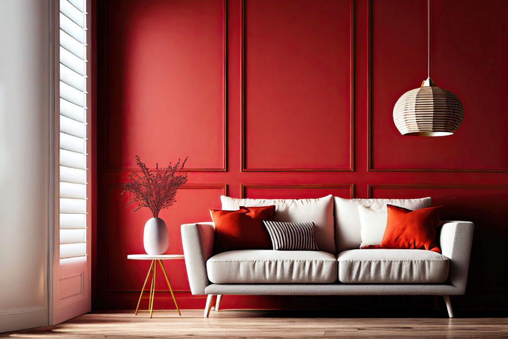
Red
Red is one of the most powerful and striking colours, especially when used in interior design. It is widely used to provoke positive emotions such as love, passion and energy. However, it can have the opposite effect in certain environments, inducing feelings of danger and fear.
In interior design, it can be used to create an ambitious and bold atmosphere usually associated with power and success. For this reason, it is commonly used in offices and creative spaces. There is a wide range of attractive red shades to choose from depending on the look you’re going for. Deeper tones such as maroon or burgundy can create a more luxurious interior. Whereas lighter shades closer to pink or orange tend to be more playful and suited for children’s rooms.
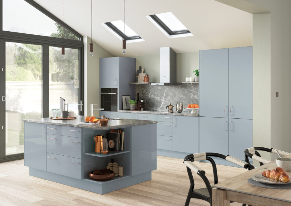
Blue
Blue encapsulates a variety of shades that can create different atmospheres and emotions. However, it is largely associated with calmness and has been shown to reduce blood pressure and heart rate.
Deeper tones of blue such as navy and royal blue are related to confidence, loyalty and trust, therefore widely used for commercial interiors where trust is important. Whereas lighter shades of blue are known to evoke a sense of peace and tranquillity, commonly used in relaxation spaces. If you’re looking to create a relaxing bathroom space or a peaceful bedroom, then using a light blue could be the answer.
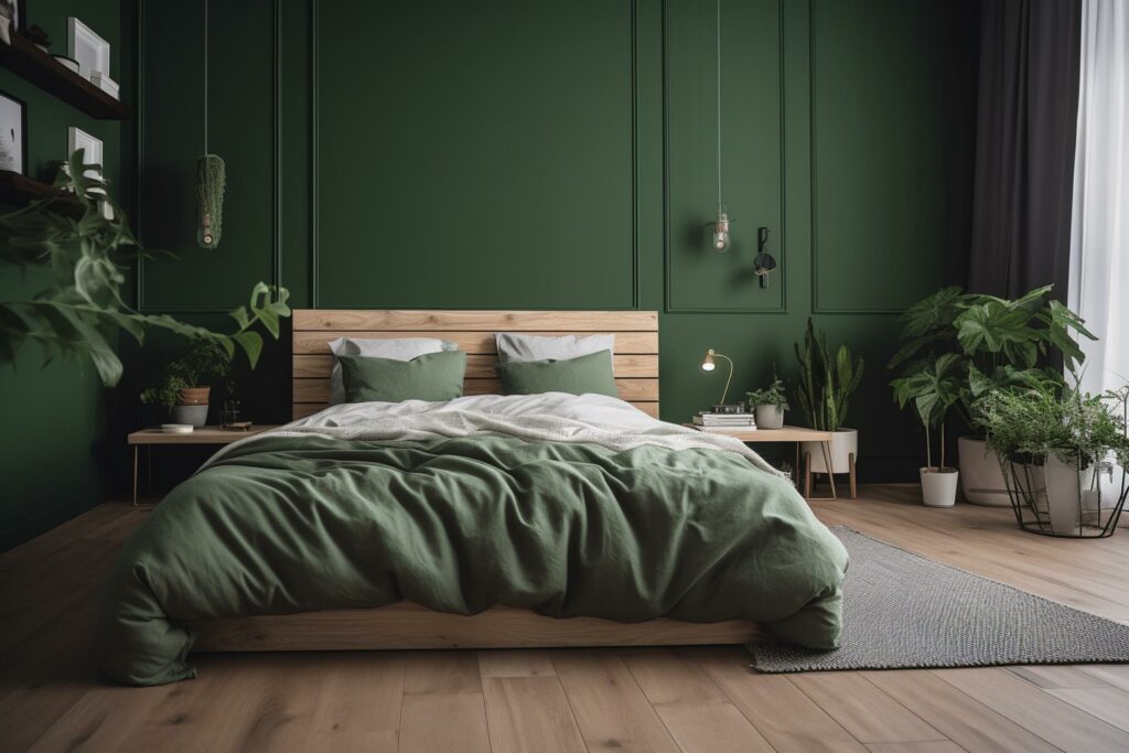
Green
In colour psychology, green is a very positive colour full of optimism, balance and peace. It is immediately associated with nature and relates to growth and restoration. This makes it a great way to bring the outdoors into your home. Like blue, green has also been shown to lower blood pressure and heart rate, due to its peaceful connotations.
Green can come in a range of attractive shades making it suitable for home interior design. Deeper shades such as olive green can create a more grounded and classic interior, perfect for a cosy bedroom. However, lighter shades of green such as mint can create a more subdued and calm atmosphere, perfect for a yoga studio or reading corner.
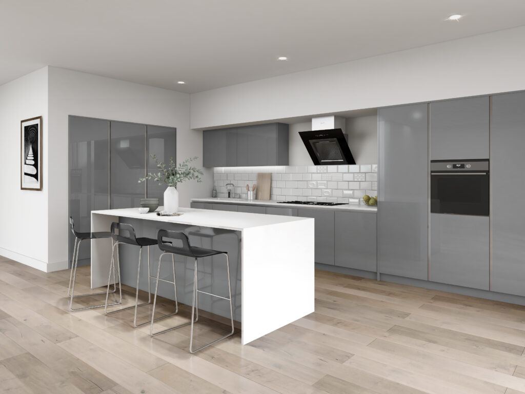
Grey
A popular choice for modern home design, grey creates a neutral and calm atmosphere. Whilst grey initially feels less exciting than other colours, it can be a great substitute for white to create a neutral base for brighter colours. Its subtle tone means it creates a sophisticated and refined environment that also represents strength and intelligence.
Commonly used in living rooms alongside yellow or pink, grey can be paired with any bright colour to create contrast and layers of interest. It can also look great paired with white and black to create a monotone theme, suited for a contemporary kitchen design.
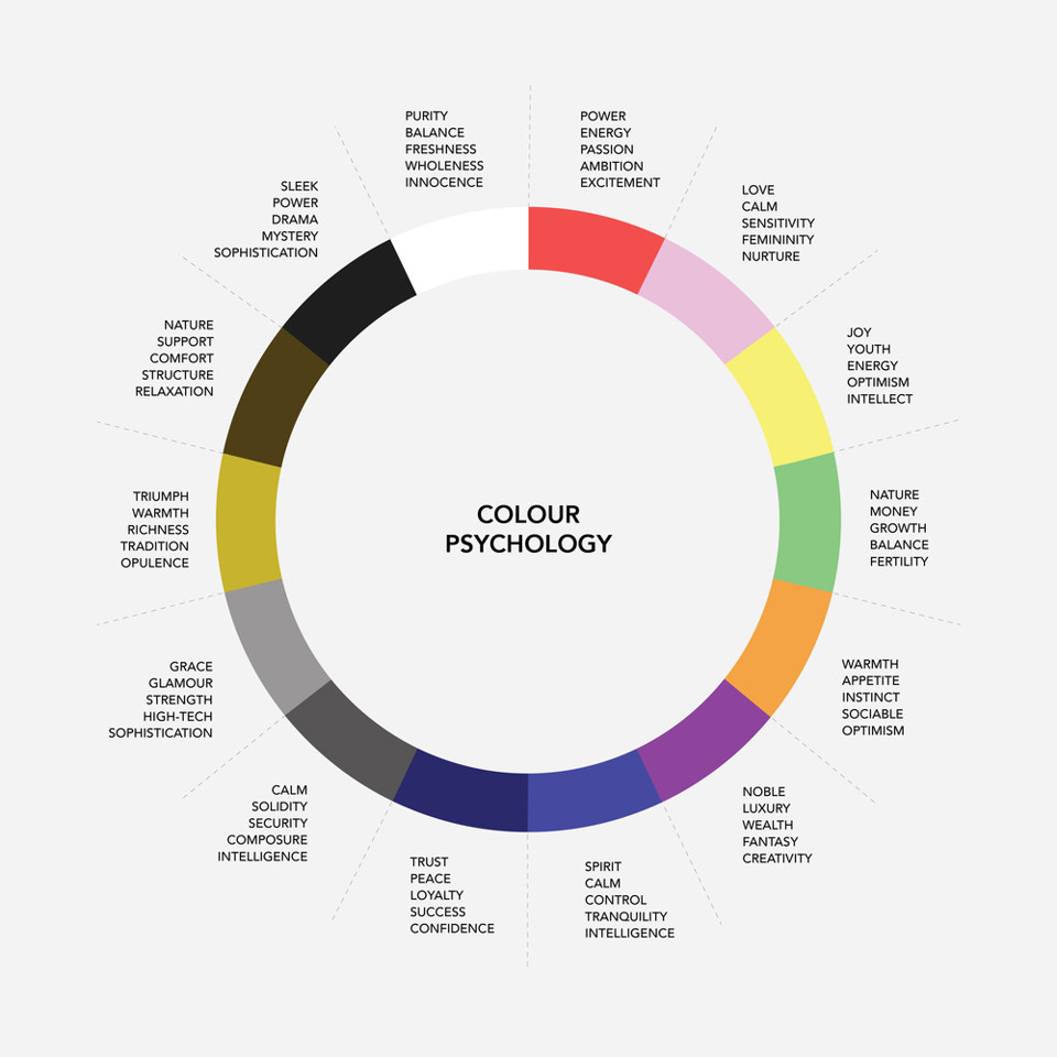
It’s crucial to think about the kind of mood you want to create in your interior and decide which colours will help you to do so. The colour wheel below gives a simple visual to summarise the feelings that different colours can create.
We hope this blog has helped you to make some more informed decisions when it comes to the colours in your home. Don’t forget to browse through our other blog posts and get in touch if you think we can help with your fitted interiors.
Recent Comments